STRATEGY MEETINGS
When you kick off a project of this size, it’s important to have clear goals as you begin. I consulted with the head of the department to establish those goals. We analyzed website traffic data, identified intended users of the site, defined user paths, and began to determine how the website needed to feel, look, and function.
Based on those meetings, I wrote a 14-page specifications document that we used to get quotes from web companies, and then they used the document to build out the website. I drew from my years of experience in website design and programming, so It addressed many technical details necessary for the programmers to build the website. In the end, this document ended up saving us close to $40,000. Toward the end of the project, the web team we hired failed to build out certain features which they said were never a part of the quoted project. We were able to refer back to this original document and prove it was a part of the initial estimate they’d given us.
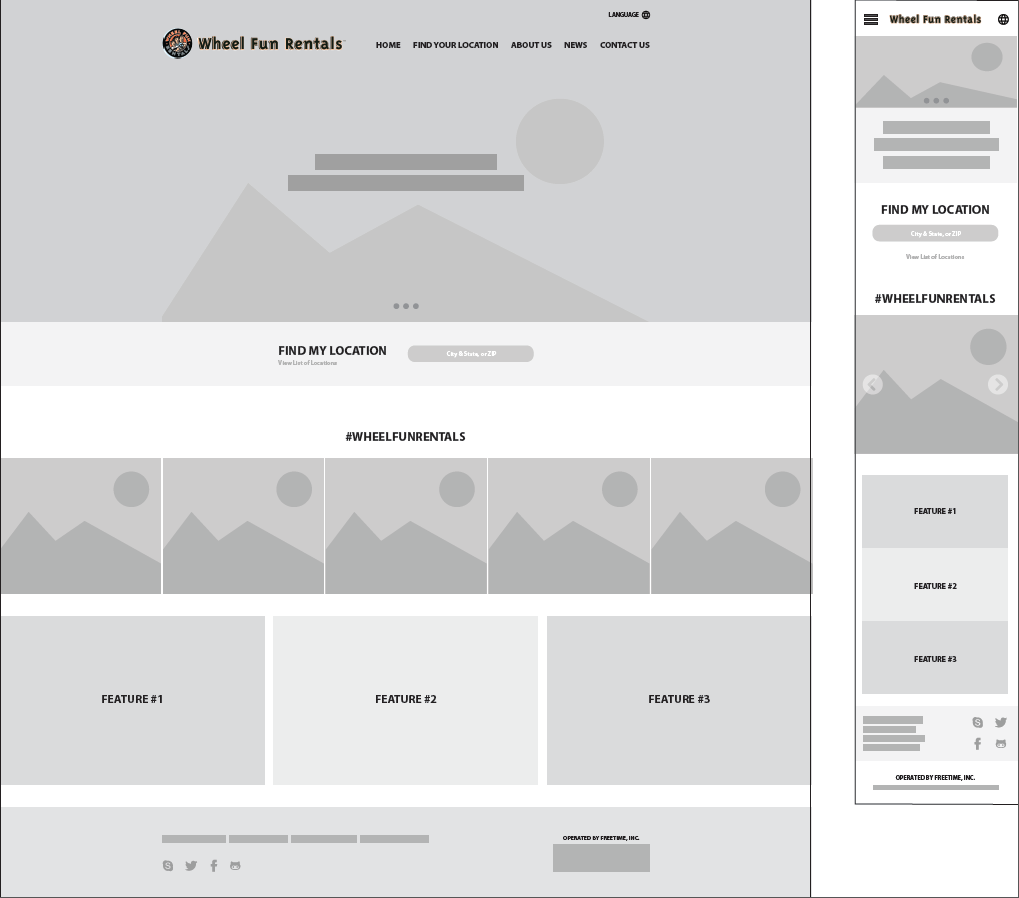
WIREFRAMING
Having identified the main goals and audiences for the website, I wireframed out the major templated pages for the site. The focus at this point was not to work on design but rather the function, user experience, and information flow.
THE PITCH
Before starting in on this project, which we knew would come close to fix figures in cost, we had to get the approval of the President and the Founder of the company.
I assembled a presentation and outlined the entire history of the company web presence (including how the brand was represented online and the structure of the CMS), trends we were observing with our years’ worth of website traffic & interaction data, competitive analysis notes, and an extensive roadmap for the new site.
BRANDING
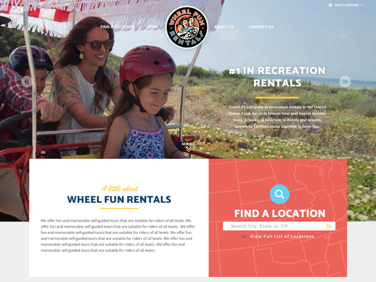
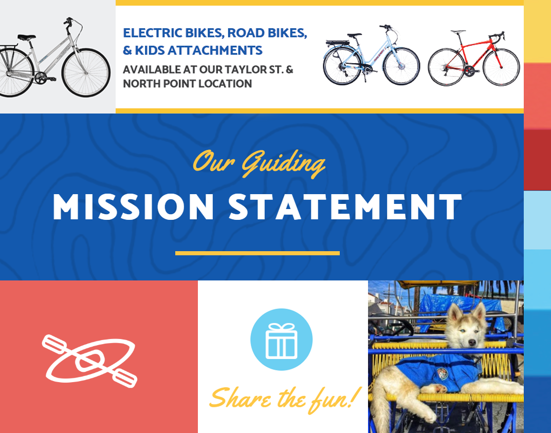
With the launch of the new website, we took the opportunity to refresh the branding guidelines. The old style used a lot of faded images and gradients.

As we began to build this new brand, we wanted to keep the same look and feel but make it modern and accessible. We started with choosing our brand fonts and colors, to ensure consistency across print and digital media. We also chose to use large images with bright, blocky colors and fonts. In the end, the branding was much more vibrant and could easily be executed across all our marketing materials.
Design elements that were used throughout the site and other collateral.
FRONT-END DESIGN
We worked in collaboration with our 3rd-party web development team to design the front-end, but the stakeholders weren’t happy with the design options the firm had given us. Though not a designer by profession, I had impressed the team enough that they trusted the designs to me. I set out to design 24 web page templates that would serve as the front-end of the 1,200+ page website, having only worked for the company
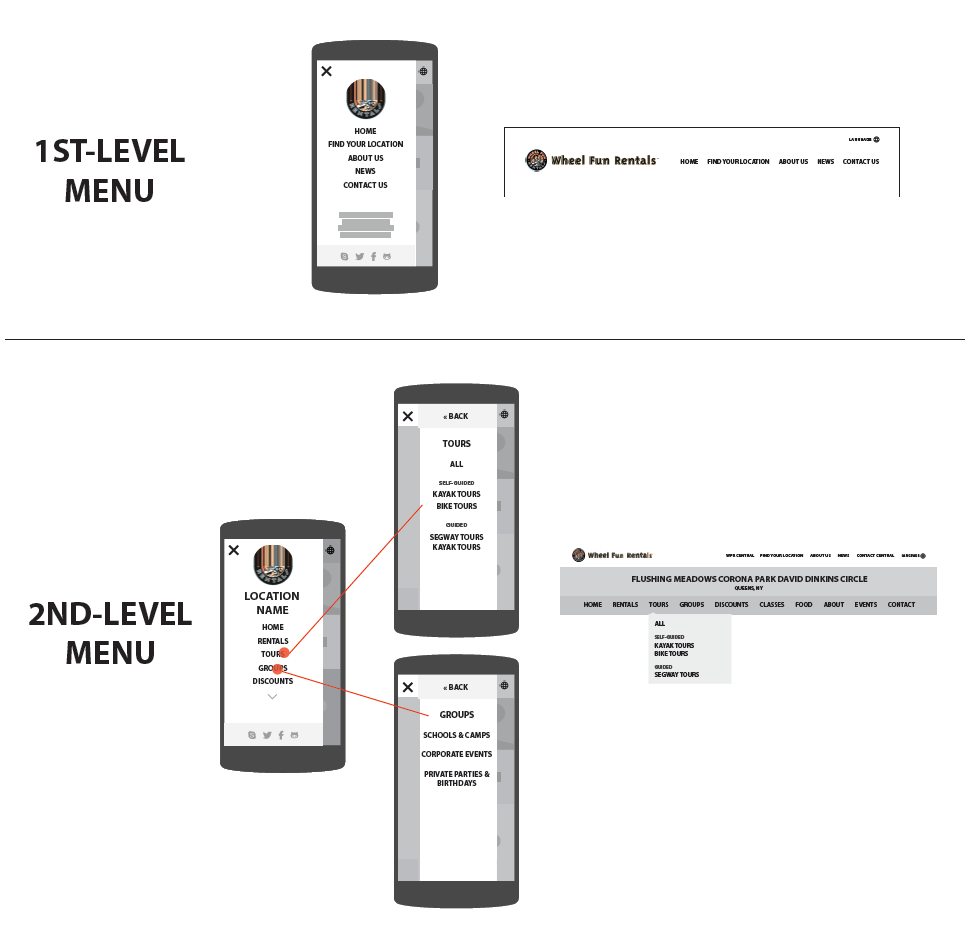
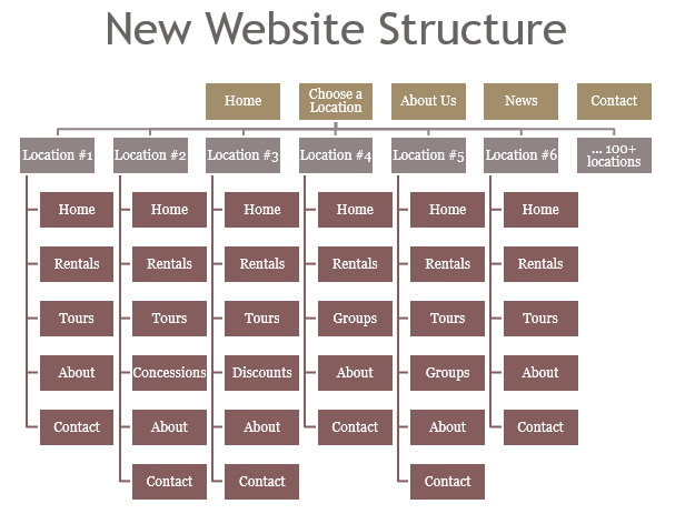
BUILDING THE FRONT & BACK ENDS
It took about a month and a half to get every template designed and signed off by the stakeholders before the development team could start their work. After sending over the final design files and talking them through with the team, we began communicating how the back-end CMS would need to interact with the design and content. I made multiple versions of each of the 24 templates to explain visually how content would be pulled from the database.
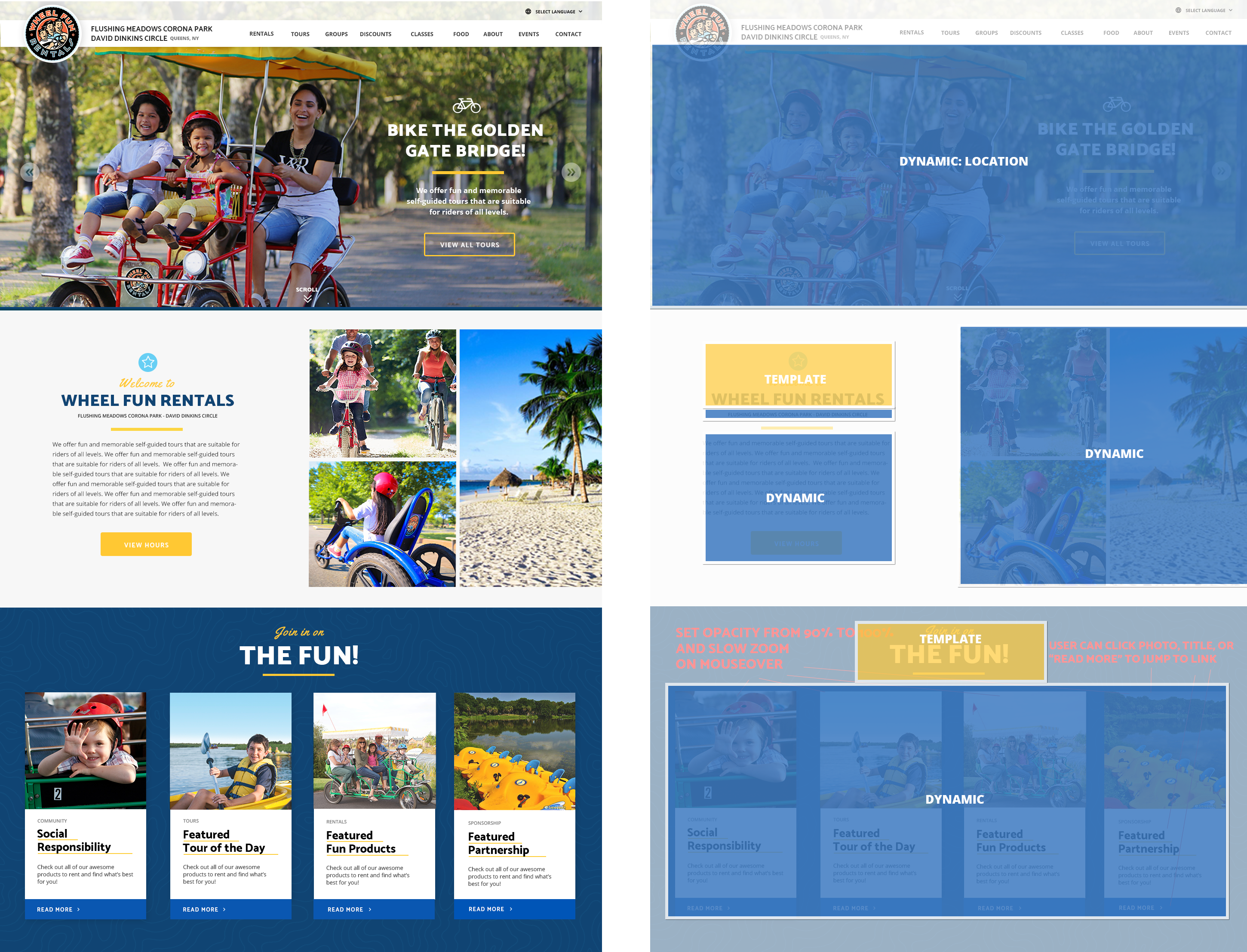
Overlays explained how the front ends would function, including pulling dynamic content, animation, and more.
CONTENT ENTRY
We had dreamt BIG with this new site and had expanded the depth of the site far beyond the old site had offered. This was exciting, but it meant that after development was completed we still had months of work ahead of us in writing, editing, and entering content. We had 100 location microsites to build out, each with 220 custom fields that had to be filled out on the back-end, and hundreds of photos to source, edit, and crop. I coordinated with my marketing team (a small but mighty team of 4) to divide and conquer, knowing that our June deadline was approaching quickly.
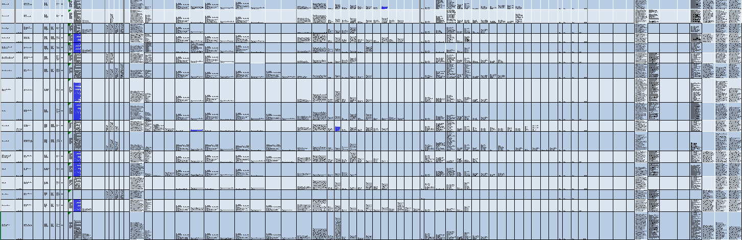
Overview of 1 of many spreadsheets used to track content as it was entered into the site.
SITE LAUNCH
After months of design work, communications about functionality, negotiating budgets and timelines, and content curation and entry, we launched the website. Within 2 months we were seeing clear, positive results:
- Pageviews went up 54% (1,020,420 vs. 661,460)
- Pages per Session went up 55% (2.99 vs. 1.92)
- Average Session Duration went up 51% (2:24 minutes vs. 1:35 minutes)
- Bounce Rate went down 48% (35% vs 67%)